If everything had gone according to plan,you’d be looking at some initial work regarding the popularity of various baby names in Ireland mainly because although the data for the UK is easy to get at, it’s also by and large, not very interesting to play with. The figures for Ireland are a bit non-straightforward to haul out of the CSO’s website so instead, I decided to look at mortality rates on the grounds that given a graph that compares 1926 and 2006, it’s a dream opportunity to look at displaying the information in the form of a slope graph.
You can find the data here and it was last updated in 2010. It might be interesting to see more recent figures if they are available but at this point, I’m not too bothered. The data is straightforward enough, it’s a 2×7 matrix, there is no cleaning to be done and no major analysis or flutering around to be done with it. For this reason, I brought it into Excel, exploited these instructions here, got slightly frustrated with various aspects of trying to do this in Excel (my next bid will be to have a look at options to do this in R which has to be easier to mess around with but I haven’t looked at whether ggplot2 does slopegraphs or not).
There’s a very simple story underlying these data: typically, in Ireland, life expectancy has increased a lot in the 80 years between 1926 and 2006.
As a general explanation of how the data works, the chart tells you on average, how many more years you are likely to live if you reach the age noted. For this reason, as you get older, the number of years you’re likely to live on from that point drops.
Okay.
Here’s the first graph:
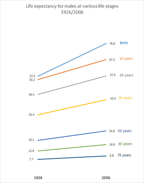
This shows changes in life expectancy for males in the period 1926 to 2006. We have only two time points so I can’t comment on odd variances in there – it is highly unlikely that the line of change is dead on straight.
Key take away points from this:
A baby boy born in 2006 is likely to live almost twenty years longer than a baby boy who was born in 1926.The biggest increases in life expectancy are for the cohort somewhere between 0 and up to 35 and 55 years. After that, the gains are nowhere near as steep. Part of this is explained by major improvements in infant mortality.
Here is the corresponding graph for females:
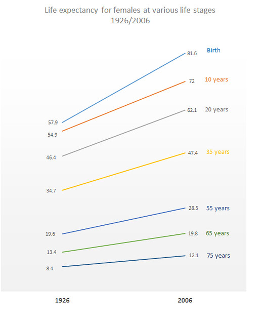
This graph is largely similar in shape to that for males – higher gains the younger you are, again linked to changes in infant mortality rates. However, females get a much bigger push at birth than males did over the period. In 1926, females expected to live on average half a year longer than males from birth. In 2006, the difference is almost 5 years. This can probably be partially explained by changes in maternal mortality over the period.
What is interesting about this in social terms is that although women are likely to live longer than men, they are less likely to be adequately provided for pension wise because inter alia, they haven’t paid into professional plans as long or haven’t made as many social welfare contributions, linked to a) not having worked through marriage (Ireland had a marriage bar until sometime in the 1970s so that married women weren’t taking jobs from family men) b) having taken time off to have children.
I’m interested in obtaining similar data for other countries – anecdotally I seem to remember reading that life expectancy at birth for males in France in 1900 was around 35 years for example.
With respect to the actual graphing of the data, doing it in Excel is easy in some respects, you wind up with a graph that’s reasonably coherent scale wise. It’s just prettifying it is a bit time consuming and not very fun. I brought it into Photoshop mainly to get it out as a decent enough jpeg. None of the relevant templates were exactly as I wanted so I need to look into building standard templates. I will, however, have a look at drawing these things in R.
In the meantime, for a later project I will look at sorting these out in Adobe Illustrator at some stage as well – it is frustrating not having access to simple things like rulers to line stuff up when you’re moving it around the plot.