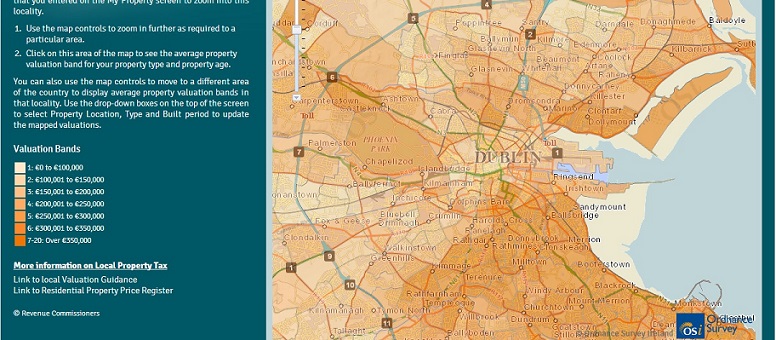
According to the Irish Times, the Revenue Commissioner’s guideline map for property values (for self assessment for the property tax we now have) has drawn a lot of criticism, mainly of the type “the values they are suggesting do not match reality on the ground”. See this report here.
I’m not, for now, going to go into any great detail on data quality and assessment of same. There are a lot of arguments to be had over that.
My issue is the map itself. Here, roughly speaking, is what it looks like (screengrabbed at 7pm) on my computer:

I firmly believe that a graphic like this should be easy to read. This one isn’t because the graduations between the different colours is very slight so that it can be hard to identify exactly which of two bands a particular area falls into.
If I were doing something like this, I’d take bigger colour differentials for the different bands rather than a graduated scheme as used above.