Undergraduate languages in the United Kingdom

I write, from time to time, on language related matters and one of the items on my list of backburner projects was to have a look at undergraduate language options in the United Kingdom. I had a look at Ireland as well but since we have 7 universities, there isn’t very much of interest to consider when it comes to language provision in Ireland. UCC is about your best option there. I’ll post the graph of that later.

The United Kingdom is interesting for a couple of reasons: firstly, tuition provision in languages has been falling off a cliff there and language departments have been closing near hand over fist. One of my recollections relating to language tuition provision in the university sector was that there was a great breadth of provision in terms of languages offered when I was looking for somewhere to study back in 1990, and given changes to language related matters in the UK in the interim, I was interested to see how things looked. Data, however, is not that easily come by and in the end I would up collecting it manually.

One of the things I wanted to do was see what the obvious clusters were and it occurred to me that using languages and higher education organisations as nodes might allow a network chart to be built. I actually did a proof of concept of that with the Irish provisions purely because there were neither too many languages nor too many universities (seven of the latter and not far off seven for the former). The network depicting software which I used was Gephi.

According to the basic research which I did, 78 higher education organisations are offering primary degrees of which a language is a major component. I suspect, if I were to look more closely and root out things like “International Business With A Language” type degrees, the number of pure language related courses would be significantly lower. I have not decided how best to sort out data to get that information and I may not do it just yet.

Eventually, when I plotted things, there was an interesting imbalance on the graph. I noted this on the graph itself for which you can find here, but it is obvious enough below too.

UnitedKingdom
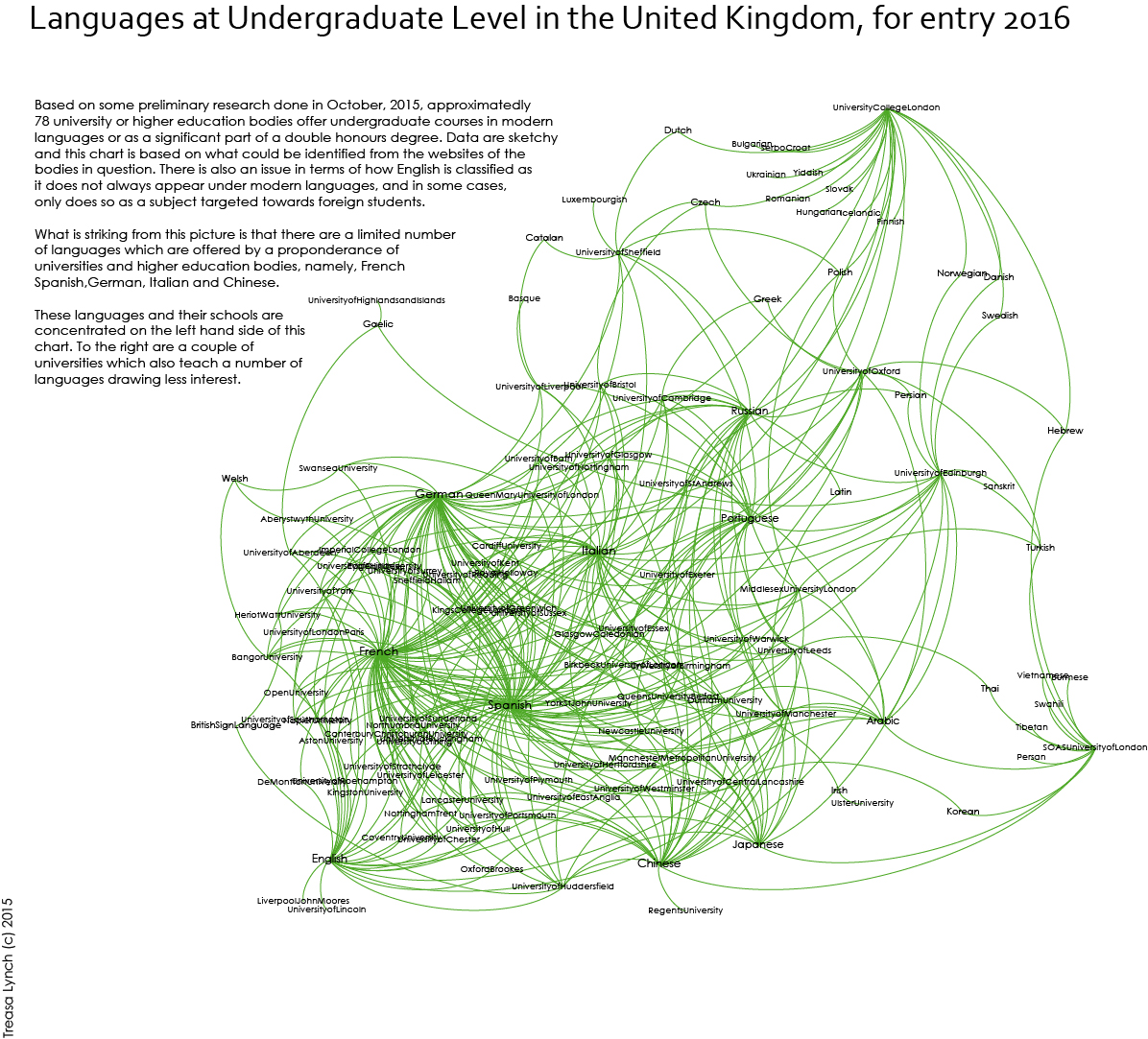
What this tells you is that if you want to learn anything other than, effectively, French, Spanish, English, Italian, German, Russian or Chinese, most of your options are limited to two universities in London or one in Edinburgh. The overwhelming number of universities which offer any language study at all draw primarily from the seven listed above. There are a few stragglers around but that’s more or less the way things are.

One of the things I would consider doing with this data at some stage is comparing language provision in the United Kingdom with language provision in the university sector in a bunch of other European countries, and also, looking at comparing provision of official European languages within the university sector across Europe. I really have no idea how I could quickly get this data together – I do not know if it’s even available anywhere. But it would be interesting to see where the holes exist in terms of provision of tuition at university level of official European languages.

Comparative infographics

There is a massive growth in the production of infographics of varying quality and if you’re interested, there’s a tumblr full of dodgy ones here. Mostly, that focuses on the quality of the graphic design and whether it accurately portrays the underlying data. 

However, I want to consider one particular type of infographic and that is an infographic that purports to compare two entities. I find they can be problematic even if they are beautifully designed. The main underlying issue is data quality.

They can be done according to a lot of useful rules such as citing the source of the data you are using for comparison – but if they miss a key component of a comparative infographic, then no matter how beautiful they are, they are still of questionable merit. Each comparison must be a like with like comparison.

So, for example, a graphic seeking to compare social media penetration doesn’t get it right if it’s loading Facebook page loads with Flickr image uploads. That’s a beyond unfair and misleading comparison. My favourite one lately has been a comparison of London and Paris in which the cost of an average dinner out was compared with the cost of dinner out in one of Paris’s more exclusive restaurants and the greater London area was not compared with the greater Paris area, the cost of a family ticket in Disneyland was compared with the annual number of visitors to Harry Potter World, prices cited were in two different currencies making the comparison almost meaningless.

Ultimately, I have to ask how highly we can praise an infographic for being graphically beautiful but not informative because the underlying data is not useful for comparison’s sake. Ultimately, I would say the value in an infographic is linked to how informative the underlying data is and where comparative graphics are concerned, whether suitable comparative datapoints have been used.

Dublin Bus routing information – the number 16 (northside) as a proof of concept

16 Bus Route in Dublin
Draft Routing information for Number 16 route (northside section)

There is a larger version of this graphic here. Please click through as it’s probably easier to read.

I’ve been back in Dublin for 14 years now and one of the things (many things) which I have still not really gotten used to is the bus system. Dublin is a sprawling city and most of its public transport is by bus with some local rail and tram handled by DART and Luas respectively and some local suburban rail which used to be called Arrow although I think some of it may now be DART

Both Colin Broderick and Aris Venetikidis have built network maps but they haven’t, as far as I can see, caught on all that widely although both have had varying amounts of coverage. I would like to have a go at that at some stage but I want to solve a different problem.

Dublin has a lot of bus stops. Dublin Bus has numbered of all of them to support a decent real time bus information system which I find pretty handy now that I have a smartphone – but it is that number of buses which makes it difficult to map the system effectively. Additionally, a lot of those stops are very close together. I lived in Brussels where there was typically a 10 minute walk between bus stops. In Dublin, it can be less than five, even for the same route.

So setting out a route map for a typical cross city bus route in Dublin is onerous if you want to list all the stops. If, however, you take a step back and consider the primary places people might want to know about, you can cut out the number of stops you display on a route substantially. The intermediate ones still exist, but for each bus route, you can create a fairly simple linear route map. What I’ve posted above is a proof of concept of such a route map, covering the northern section of the number 16 bus route. I chose that one for fairly simple reasons – I know it very well and it’s got a number of useful landmarks along the route.

The graphic above only shows a subsection of the route – namely Dublin Airport to Ballinteer. I have a number of design considerations in place:

  • I haven’t decided for sure that the 45 degree slope for the landmarks is the final version – I may bring it up to ca 60 degrees. 
  • I wanted each terminus and each major city centre stop to stand out. Obviously DIT is not the terminus for this particular route but as it’s the last one on the proof of concept graphic, it’s getting the treatment (for now at least).
  • For stops with particular features, such as transfers onto rail or Luas, I wanted to include a graphical representation of that access using the relevant logo. I discovered in doing this that Irish Rail has a new logo which I didn’t recognise. This reduces its informational value but I am (naively, perhaps) assuming that as people become more familiar, they won’t be wondering what the funny little flag thingie is.
  • I wanted the graphic to also give some information regarding which areas the bus passed through which may be of use as well as knowing that this bus goes past Saint Patrick’s College, for example.
  • Theoretically, each route should get its own colour but Dublin Bus has a lot of routes and this may not actually provide that much useful information if there are 30-40 different routes. Mostly we use colour to identify a particular route in some of the better known transit maps (I will always know that I lived on the light blue Metro Line 13 in Paris, for example). That colour association, even as it gets complicated, is something that is easy to learn if you are starting from a small number of lines and then just adding to them. A big blast of lines together is somewhat like too much information.
  • There’s a comment about frequency. The 16 has a complex time table first thing in the morning – in fact, no bus leaves Dublin Airport before 8am based on the time table although a substantial number of them are under way from Larkhill and parts of Beaumont and Santry from about 6.20 in the morning. I’ve mixed feelings about including this sort of information for the simple reason that it’s incomplete, and yet more complete information makes the graphic less informative as it’s harder to read quickly.
  • There are a couple of things I am reconsidering visiting (this is draft one, basically) regarding the layout but before I do so, I probably need to complete the entire route out to Ballinteer. The list of suburbs may need to be reconfigured a little and the bus route number brought over to the left, for example. The GAA logo is a little too big for my liking.
  • I’ve noticed the typo. I will fix it in the next draft.
  • I should probably include the Rotunda for the Parnell Square stop and also note that the bus stops are on different sides on Parnell Square depending on whether you are travelling northbound or southbound. This affects a lot of north/south services.

The mere act of producing this has been interesting however; it’s given me more ideas for things I want to do around the bus routes in Dublin, something, which like the neutrality markings might wind up being an all consuming project for a while. There will be a second iteration of this when I have more information regarding the southern section of the route, and when I’ve made more final decisions around things like route colour and font formatting.

Feedback is welcome.

Additional Note: See work done here on Cork’s bus service: https://www.facebook.com/pages/Map-of-Cork-City-Bus-Services/137667036266836

Information sources:

Dublin Bus – No 16 Timetable and routing information.