Undergraduate languages in the United Kingdom

I write, from time to time, on language related matters and one of the items on my list of backburner projects was to have a look at undergraduate language options in the United Kingdom. I had a look at Ireland as well but since we have 7 universities, there isn’t very much of interest to consider when it comes to language provision in Ireland. UCC is about your best option there. I’ll post the graph of that later.

The United Kingdom is interesting for a couple of reasons: firstly, tuition provision in languages has been falling off a cliff there and language departments have been closing near hand over fist. One of my recollections relating to language tuition provision in the university sector was that there was a great breadth of provision in terms of languages offered when I was looking for somewhere to study back in 1990, and given changes to language related matters in the UK in the interim, I was interested to see how things looked. Data, however, is not that easily come by and in the end I would up collecting it manually.

One of the things I wanted to do was see what the obvious clusters were and it occurred to me that using languages and higher education organisations as nodes might allow a network chart to be built. I actually did a proof of concept of that with the Irish provisions purely because there were neither too many languages nor too many universities (seven of the latter and not far off seven for the former). The network depicting software which I used was Gephi.

According to the basic research which I did, 78 higher education organisations are offering primary degrees of which a language is a major component. I suspect, if I were to look more closely and root out things like “International Business With A Language” type degrees, the number of pure language related courses would be significantly lower. I have not decided how best to sort out data to get that information and I may not do it just yet.

Eventually, when I plotted things, there was an interesting imbalance on the graph. I noted this on the graph itself for which you can find here, but it is obvious enough below too.

UnitedKingdomWhat this tells you is that if you want to learn anything other than, effectively, French, Spanish, English, Italian, German, Russian or Chinese, most of your options are limited to two universities in London or one in Edinburgh. The overwhelming number of universities which offer any language study at all draw primarily from the seven listed above. There are a few stragglers around but that’s more or less the way things are.

One of the things I would consider doing with this data at some stage is comparing language provision in the United Kingdom with language provision in the university sector in a bunch of other European countries, and also, looking at comparing provision of official European languages within the university sector across Europe. I really have no idea how I could quickly get this data together – I do not know if it’s even available anywhere. But it would be interesting to see where the holes exist in terms of provision of tuition at university level of official European languages.

National bus stops

Having done Dublin Bus, it occurred to me to see if the Bus Eireann network was available. It is.

BusEireann

This is actually a bit more interesting than the Dublin Bus one for various reasons, specifically the gaps. I’m fascinated by the big hole in the middle and I will probably look at doing some additional work in terms of other spatial data.

I’ve just been asked where I get the data and it’s remiss of me not to credit the data source. The data for both Bus Eireann and Dublin Bus, plus a number of other operators is available on Transport for Ireland’s website. The link is here.

I haven’t cleaned up this graph all that much and I have additional plans for this and the other transport data that I have been looking at.

The beauty in Dublin Bus Stops

I have an ongoing project in the area of public transport in Dublin, which has a) stagnated for a while and b) grown a bit since I have had to interact more with public transport in Dublin.

DublinBusStops

This is one of the items on the project list. This image is a scatter plot of Dublin Bus latitude/longitude values for Dublin bus stops. The file this is based on, which I pulled into Excel to do this (yes, I have other plans involving R at some point which may see this revisited) has more than 4700 datapoints. Looking at it like this, I’m going to see if I can find a similar dataset for street lights. I think it’s a rather beautiful looking spiders’ web.


Flight routes operated by Aer Lingus out of Ireland

Following yesterday’s project with the Ryanair route data, I did the same for Aer Lingus this morning. I included one extra chart, mainly because of the northwest Atlantic destinations which are served by Dublin and Shannon and I wanted a view on how many airports service two routes.

So here are the charts.

AerLingus_EX_IRL

Complete network

AerLingus_EX_IRL_2

Airports serving at least 2 routes

AerLingus_EX_IRL_3

Airports serving at least 3 routes.

So there are a couple of points to note about this. Both the Ryanair and Aer Lingus data were imported into Illustrator to build a web friendly file format (I exported the graphs as PDFs. I am primarily an expert in Photoshop rather than Illustrator so there are a few things I missed yesterday, which I could fix on today’s files particularly with respect to label positioning. I did this specifically for the second and third charts.

The underlying data have some similarities. For Aer Lingus, Dublin has something in the region of 80 destinations which is not that dissimilar to Ryanair’s offering. Aer Lingus flies out of a couple of extra airports, namely Belfast and Donegal but the routes concerne are limited – Belfast targets London at the moment, and Donegal targets Dublin. The other point to note about this data is that it includes destinations operated by either Aer Lingus, or Aer Lingus Regional (operated by Stobart) but not connecting destinations beyond their hubs in North America, for example. Direct flights only.

Just a brief comment on those airports with three or more routes outbound: they include the following:

  1. Cork
  2. Dublin
  3. Shannon
  4. London Gatwick
  5. London Heathrow
  6. Manchester
  7. Birmingham
  8. Bristol
  9. Edinburgh
  10. Lanzarote
  11. Malaga
  12. Faro

This is significantly UK focused compared to Ryanair which was highly holiday destination focused. I’m not saying you couldn’t go on your holidays in Manchester or Birmingham…but I suspect most people don’t.

I am not really finished with this project – I have a couple of other thoughts about it and I’d also like to look at combined connectivity out of Ireland across all airlines. That data is going to take a while to gather up and certain things I want to do I am not sure are possible using Gephi. I will also look at graphic decisions like the fonts and colours as well.

Flight routes from Ireland operated by Ryanair

Flights operated by Ryanair from Ireland

The image above is a network chart of flights out of Ireland as operated by Ryanair from the following airports:

  • Cork;
  • Dublin;
  • Kerry;
  • Knock Ireland West; and
  • Shannon.

The data is not organised geographically, but in terms of connections between nodes. The nodes on the charge are various airports, and the links, or edges are operated routes. This chart shows all the connections between the five Irish airports above and any airport that Ryanair flies to from those airports.

However, Gephi allows you to fine tune what you want to see, and so there is this:

Ryanair_EX_IRL_3

This basically includes only those nodes which have three connections to other nodes. So only those airports which are destinations for at least 3 other nodes in this network. If you like, it basically includes destinations which are served by Ryanair from at least three airports in Ireland. Without looking in too much detail, you could probably guess a few: London Stansted is an obvious candidate. Dublin still has the most connections; this is not surprising as it had 80 or so to begin with.  But the target airports are interesting:

  • Alicante;
  • Faro;
  • London Stansted;
  • Malaga;
  • Tenerife South;
  • London Gatwick;
  • Palma;
  • Lanzarote;
  • Milan Bergamo;
  • Girona Barcelona; and
  • Liverpool.

Most of those airports, with the exceptions of London Gatwick and Stansted, and Liverpool, are holiday destinations. The outlier – as in the one I did not really expect to see – was Milan Bergamo.

The graph would probably be bigger if I stripped it down to airports with two connnections, mainly because Dublin has destinations in common with most of the other airports. Fuerteventura is one of the few destinations which is served by Cork and Shannon but not by Dublin, for example.

Gephi is a really nice tool to use for stuff like this and I have other plans for it. This is actually the first project I have done using it and I have an interest in figuring out how much more I can customise to use more data. For example, there is no weighting on any of the edges in either of the graphs above, and that parameter could probably be used to demonstrate frequency or seasonality. I have other plans as well. I also have plans to do something like this with bus routes in Dublin and general public transport, for example.

Couple of notes about the data:

  1. Route data was collected on 12 May 2015. As such, it will go out of date as Ryanair update their routes out of Ireland.
  2. It does not take account of any seasonal differences: all of these flights may not operate year round. Personally am considering a flight to Grenoble myself as I did not know one existed until today.
  3. This is a proof of concept for other work I want to do later with transport routing.
  4. I will probably look at other airlines later if I can access the data easily.

Mercer Quality of Living Survey 2015

Much was made in Ireland, this morning, of the news that Dublin had rated highly in the annual Mercer Quality of Living Survey. This survey is carried out to provide some guidance for companies who are expatriating staff in terms of cost of living, suitable salaries for staff being relocated, and related matters. I have generally relocated myself so this is not something I have ever worried about but I had a look at the reports anyway.

Dublin came in joint 34th place with Boston. This placed it higher than London and New York, and depending on which reports you read, outranking either London or New York was the hook most of the media went with.

You can, with a little cooperating with Mercer, have a look at the data by clicking on “See Full List” on this page. So I did that because I wanted to have a closer look at the list and perhaps think a little more about whether, in fact, 34th place was good for Dublin or not. The only other Irish city on the list was Belfast and it came in at 63rd place.

One of the single most interesting things that struck me about the top end of the list was the prevalence of German speaking cities. The highest ranked English speaking city is Auckland. There are only two other English speaking cities in the top ten, namely Vancouver and Sydney which squeaks in at 10. Five cities are German speaking and of those five, three are in Germany and Switzerland.

No other country has more than one city in the top 10. Even if you stretch that out to the top 20 cities, Germany is still looking good.

Top 20 cities by country

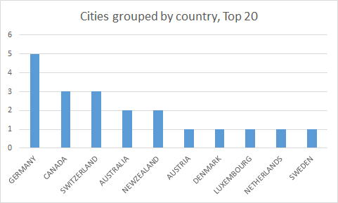
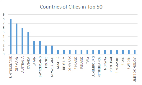
Basically, a quarter of the top 20 cities ranked by quality of living, are in Germany. After that, if you stretch it out to include the top 50, the US squeezes in 8 cities. Germany still has 7. Australia has 6 which has to include pretty much all their major cities when you think about it.

Top50citiesbycountry

Once I was done being surprised at the prevalence of German cities in the top ten, and Australian cities in the top 50, the other thing which caught my interest was that realistically, none of the top ranked cities were particularly big.

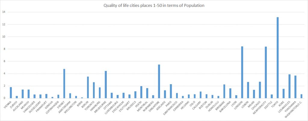
Here’s how they rank, left to right, in terms of population.

Top 50 cities by population

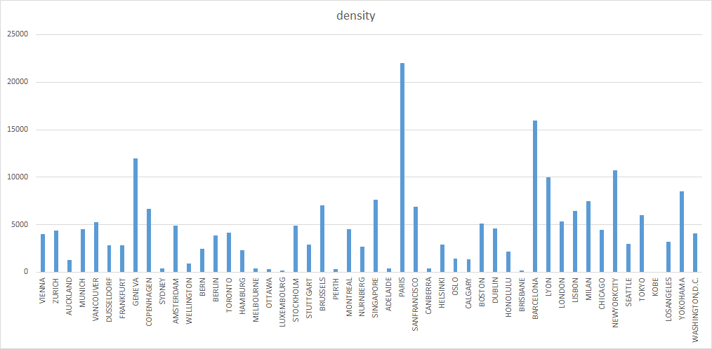
and here’s how they rank, left to right, in terms of population density.

Top 50 cities by density

There is a point to be noted about the population figures. If you look up population figures for most of these cities, you will find a number of figures, namely the figures for the city’s administrative area, and a metropolitan area figure. Taking Paris as an example, its population is 2.273 million inhabitants. The Paris metropolitan area, however, includes around 10 million people. For Tokyo, the difference is even more extreme: its population is given as around 13 million inhabitants; its metro area as 35 million.

That being said, Paris and Tokyo are two of only 6 cities in the top fifty cities in this ranking whose populations exceed two million. After you come to terms with the idea that the best quality of living standards are basically in Germanic speaking countries, the next point to be picked up is that the best quality of living is in comparatively low population cities. The highest ranked city with a population greater than 2 million is Sydney which comes in at 10th place; the next highest is Melbourne.

An interesting feature about Sydney, and Melbourne, and in fact, other English speaking new world cities (so Auckland, Ottowa and Brisbane as well) is compared to most of the other cities around them in the rankings, they have very low population densities. In terms of population densities, the three high hitters are Geneva, Paris which is way, way out in front in terms of population density, and Barcelona.

So while you could suggest that there is a quality of living premium to be gained from living in comparatively small cities by population, the same pattern doesn’t exist in terms of population density. The vast majority of cities come in with a population density below 5000 inhabitants per square kilometre and above 1000. There are notable outliers either side of that band. All six Australian cities come in below 500 inhabitants per square kilometre including both Sydney and Melbourne, the two biggest Australian cities featuring in the list.

What I do not have access to at this point is a detailed description of the features on which this ranking is calculated and that is a pity as I would be interested to see what those features were, and how weighted they were, and more to the point, whether all of them were necessary.

I would also be interested to see on what basis cities were selected for review. The populations for Bern and Geneva, for example, are below 200,000. The lowest ranked city is Baghdad. Manchester does not feature which is surprising bearing in mind that Aberdeen does and it has less than half the population. Of the five UK cities in the list as a whole (not just the top 50), two are in Scotland. Only two cities from France feature. It is hard to argue that quality of living wise, Nice comes in somewhere below Baghdad. It is clear that the choice of cities is not on the basis of population but given Mercer’s primary business, it may well be in terms of the cities they get inquiries about.

From an Irish point of view, you could ask whether Dublin is doing well coming in at 34th place. Coming in ahead of London and New York City might look good except both London and New York are large cities and as already noted, larger cities are not ranking very highly here. Without knowing what the basic criteria for the survey were, it is, to some extent, guess work, to identify where the gaps are in terms of improvement. I would suggest that arguably, the following items could be addressed:

  • public transport
  • health system
  • cost of rental accommodation

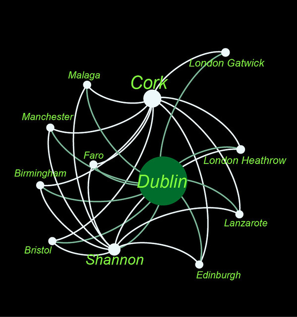
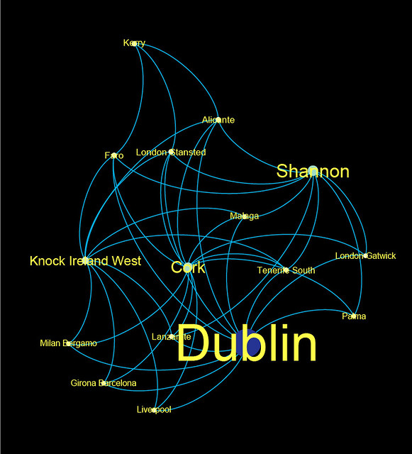
Connection wise, Dublin is well connected with most of Europe and some key locations in North America. Culturally, it is reasonably well served, if not as well as some of the other cities on the list. Shopping wise it isn’t terrible. But then, this is true of cities ranked more highly on the list, like Brussels in 23rd place. Admittedly, accommodation and public transport, in my view, almost certainly should rate Brussels higher than Dublin.

If I were somewhere in Dublin City Council where policies get made and implemented, what would I want to do with this, if anything? Is it something useful to have under random news or is there anything to be learned. Given the audience of Mercer reports, ie, companies relocating staff, and Ireland’s heavy dependency on foreign direct investment, is there anything to be noted here?

___________________________________________________

Ranking data available from Mercer

City and density data from Wikipedia

Density data not available for Kobe, Japan
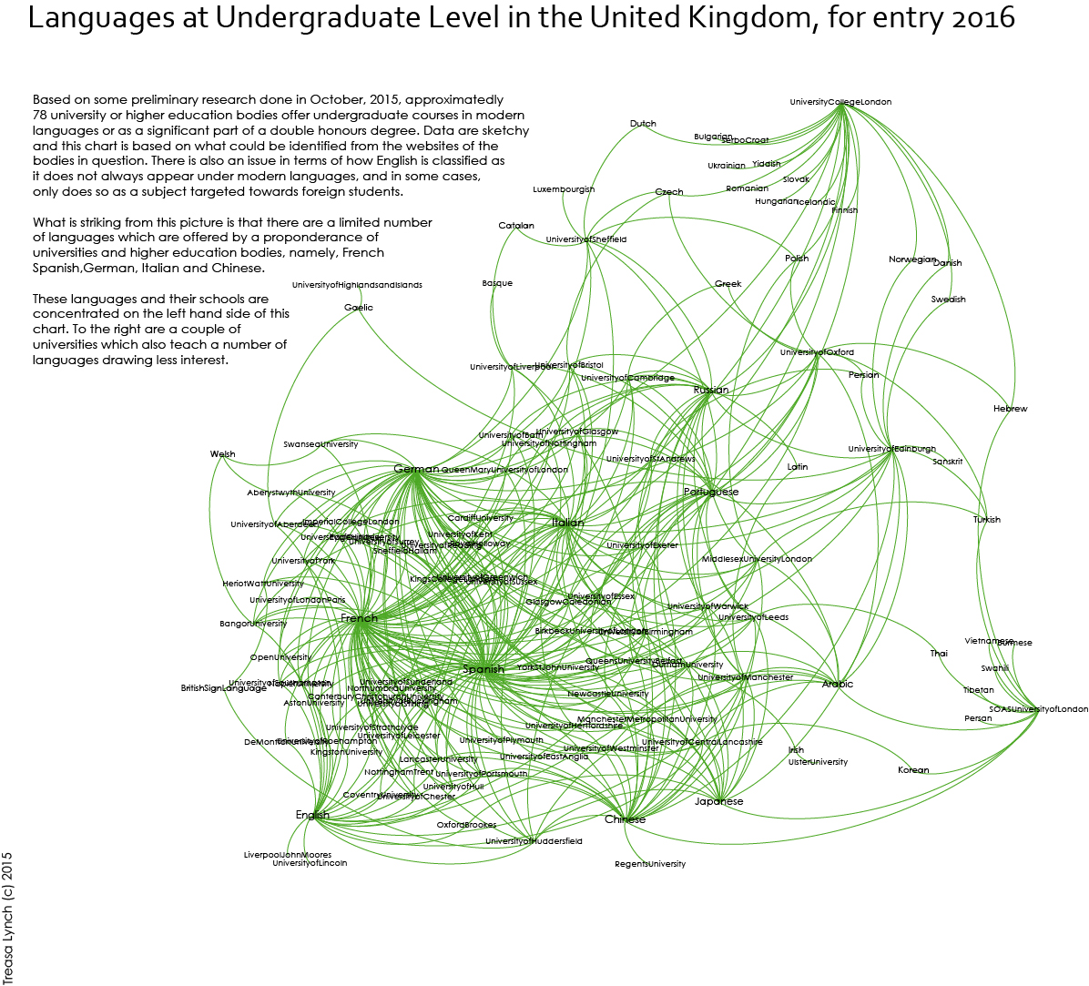
 

AIRO – Two Tier property market

It’s not dated so I am not absolutely certain when AIRO posted this to their site. It’s a graph of the changes in two sections of the Irish property market since 2005, Dublin, and National ex-Dublin.

It’s very interesting for a couple of reasons. It demonstrates that both the increase and decrease in market prices in Dublin was sharper than it was in National ex-Dublin. This doesn’t totally surprise me – anecdotally there has always been some evidence to suggest the prices are were behaving at more extreme levels in Dublin. It’s interesting to see how the graphlines cross (do click through – it’s worth it).

The data is from the CSO and as far as I am aware, CSO data is limited to the mortgage market. This is interesting because there is some evidence to suggest that a lot of the market in Dublin, in particular, in recent months, has been cash driving. Without having the CSO data in detail, and a cleaned up extract from the Property Price register, it would be hard to say for certain what the split was.

The other chief regret I have about this data is that it only goes back as far as 2005. I’m mindful of sounding like an auld one but there is some evidence to suggest that the period from about 1997 might be educational as well. I guess a lot depends on what data you have available to you.

Anyway, this was done in Tableau and there is some scope for playing around in it. I am glad AIRO did it – it’s a useful exercise, and perhaps, there might be some scope for doing a county by county comparison. We have a lot more data now on the property market than we did even 3 years ago (yes, I have some programming under way for it myself) so information should be easier to come by, particularly if and as we get postcodes, the data will be cleaner up front.

Changes in Life expectancy in Ireland between 1926 and 2006

If everything had gone according to plan,you’d be looking at some initial work regarding the popularity of various baby names in Ireland mainly because although the data for the UK is easy to get at, it’s also by and large, not very interesting to play with. The figures for Ireland are a bit non-straightforward to haul out of the CSO’s website so instead, I decided to look at mortality rates on the grounds that given a graph that compares 1926 and 2006, it’s a dream opportunity to look at displaying the information in the form of a slope graph.

You can find the data here and it was last updated in 2010. It might be interesting to see more recent figures if they are available but at this point, I’m not too bothered. The data is straightforward enough, it’s a 2×7 matrix, there is no cleaning to be done and no major analysis or flutering around to be done with it. For this reason, I brought it into Excel, exploited these instructions here, got slightly frustrated with various aspects of trying to do this in Excel (my next bid will be to have a look at options to do this in R which has to be easier to mess around with but I haven’t looked at whether ggplot2 does slopegraphs or not).

There’s a very simple story underlying these data: typically, in Ireland, life expectancy has increased a lot in the 80 years between 1926 and 2006.

As a general explanation of how the data works, the chart tells you on average, how many more years you are likely to live if you reach the age noted. For this reason, as you get older, the number of years you’re likely to live on from that point drops.

Okay.

Here’s the first graph:


Males

This shows changes in life expectancy for males in the period 1926 to 2006. We have only two time points so I can’t comment on odd variances in there – it is highly unlikely that the line of change is dead on straight.

Key take away points from this:

A baby boy born in 2006 is likely to live almost twenty years longer than a baby boy who was born in 1926.The biggest increases in life expectancy are for the cohort somewhere between 0 and up to 35 and 55 years. After that, the gains are nowhere near as steep. Part of this is explained by major improvements in infant mortality.

Here is the corresponding graph for females:

Females


This graph is largely similar in shape to that for males – higher gains the younger you are, again linked to changes in infant mortality rates. However, females get a much bigger push at birth than males did over the period. In 1926, females expected to live on average half a year longer than males from birth. In 2006, the difference is almost 5 years. This can probably be partially explained by changes in maternal mortality over the period.

What is interesting about this in social terms is that although women are likely to live longer than men, they are less likely to be adequately provided for pension wise because inter alia, they haven’t paid into professional plans as long or haven’t made as many social welfare contributions, linked to a) not having worked through marriage (Ireland had a marriage bar until sometime in the 1970s so that married women weren’t taking jobs from family men) b) having taken time off to have children.

I’m interested in obtaining similar data for other countries – anecdotally I seem to remember reading that life expectancy at birth for males in France in 1900 was around 35 years for example.

With respect to the actual graphing of the data, doing it in Excel is easy in some respects, you wind up with a graph that’s reasonably coherent scale wise. It’s just prettifying it is a bit time consuming and not very fun. I brought it into Photoshop mainly to get it out as a decent enough jpeg. None of the relevant templates were exactly as I wanted so I need to look into building standard templates. I will, however, have a look at drawing these things in R.

In the meantime, for a later project I will look at sorting these out in Adobe Illustrator at some stage as well – it is frustrating not having access to simple things like rulers to line stuff up when you’re moving it around the plot.