Finding ships on the web

I had a text message from a friend yesterday. He was in Calais, waiting to make the Channel Crossing with P&O Ferries. The company had texted him earlier to warn him of disruption but information was otherwise thin on the ground.

In fact, yesterday, if you were a P&O customer looking for information about how your crossing was going to go, from them, your information was limited to phoning a number which was on their site. In this day and age, I think that’s crazy.

My background is in the aviation sector and I know, for example, that you can, for most flight companies, get flight information through their websites and through their mobile applications. Some companies will flag serious delays via their twitter feeds and updated news information on the website. Granted, not all of them. But to a great extent, there is a recognition there that technology could be used to enhance airline to passenger communications.

My friend was told his ship was likely to be 45 minutes late when he got to check in. There wasn’t any sign of a ship though.

I see things like this as a challenge. And unlike him, I happened to be sitting at a computer.

P&O’s most useful tweets amounted to “Your ship will be late, but check in on time anyway”. They have no useful operational information on their website. So I abandoned them and went for the shipping equivalent of FlightRadar24, a website called MarineTraffic. It’s a really nifty site and from it I could identify the two P&O ferries which were en route from Dover to Calais and made an educated guess which one he would be most likely to be getting on. From that, I could tell him how far away his ferry was and at approximately what time it would arrive in Calais.

If you’re sitting on a quay in the wind and rain, and all you have to go on is your ship will probably be leaving 45 minutes late, and someone sends you a text and says “your ship is 15 minutes away from Calais at the moment”, this helps a lot. A few weeks ago, my friend did likewise for me when I was sitting in the gate area at Charles de Gaulles in Paris waiting to come back to Dublin; he checked what time the outbound flight from Dublin had left and we estimated what time the return would be leaving. People hate delays at the best of times, but delays with no concrete information, that’s really not great either.

There are two messages I take away from this.

  1. P&O could do a lot more to inform their passengers both via twitter and via their website. People don’t tend to want to calling automated phones for operational information any more. It’s old technology and it’s largely been superceded.
  2. Very often, even though the information is not straightforwardly available, it can be found somewhere. I found it and passed it on, up to and including what the state of play was later with the number of ferries arriving in Dover at approximately the same time (there were three queued up at one point).

So what would I suggest? Well, P&O need to feed operational information regarding delays to their twitter feed. My guess is that they don’t want to do this in case people just show up late to check in but people’s time is money. Perhaps we need to find away to accommodate late check in when we know a ship is going to be late. And they probably need to feed that information onto their own website although I have to say, I hope they are considering a website redesign. The site could do with it.

Marinetraffic.com has an iPad application which was very useful later when I was AFK. I’m not sure how it would behave on a phone but it definitely was better than the  website is through a browser. It could well be worth the investment if you’re travelling by sea during the winter when delays and cancellations are more likely.

 

Food poverty in Ireland

The Journal website published a story on Food Poverty in Ireland which you can find here. Its main selling point is that the numbers apparently at risk of food poverty are shown on a map of Ireland. It was based on a release by Unite and Mandate and you can find a text from them on the subject here. It’s titled Hungry for Action – Mapping Food Poverty in Ireland.

The map, I suppose, is eye catching. But I don’t think it really works to communicate the problems. For me, the first issue is that the absolute figures are fairly meaningless. Yes, it’s horrible that 112,300 people are at risk of food poverty in Dublin but if you actually take the food poverty figures and calculate them as a proportion of the population for each county, you realise that actually, proportionally, the risk of food poverty is comparatively lowest in Dublin as a proportion of the local population.

foodpoverty

Dublin has the lowest proportion of its population at risk of food poverty when we split the population as a whole according to counties.

And that’s before you even look at how the figures are generated in the first place.

The most recent figures available are for 2010 and the figures which the Hungry for Action report provides are extrapolated from these figures:

‘Constructing a Food Poverty Indicator for Ireland’, a study published by the Department
of Social Protection61, found that one-in-ten people experienced food poverty in 2010, or
approximately 457,000 people.

The following attempts to estimate the level of food poverty in each county. This is only
an approximation as the study does not provide this data. The approximation factors in
variations in income level (and assumes that income levels will alter the percentage in
food poverty) and 2010 population estimates. Therefore, these figures should be treated
as indicative.

So here’s one big problem already. We can’t really rely on the figures. They are based, to some extent, on guess work, and on an assumption relating to income levels. And they come with the following health warning: They are based on a government study from 2010 which did not break down its global figure according to county.

It should be noted that the above estimates are likely to be conservative.
As stated above, these estimates are based on 2010 data. In 2011 (the last year we
have data for) general deprivation rose by 8 percent. Further, the ESRI described
subsequent budgets as ‘regressive’.

What worries me here is that the figures, as provided in the map graphic, are akin to guess work. They are a breakdown of a national figure with no corresponding data available at county level to even base an extrapolation on. Put simply, we actually don’t know how many people are at risk of food poverty and certainly not split according to county. I’m not sure I agree with releasing a report like this given the caution and caveats with which the figures need to be approached.

However, if we leave that aside, I’m still unhappy with the use of a map to highlight this issue because it doesn’t tell you anything much in relative terms about which parts of the country are particularly affected. The piece by The Journal focuses on the absolute numbers:

The map shows Dublin fares worst with 112,300 people suffering food poverty. Larger counties like Cork and Galway follow close behind, with 50,500 and 25,300 people in need of assistance respectively.

The key problem with this is that – if we accept the figures as being in any way indicative which I have doubts about, Dublin’s figure as a proportion of the population is actually the lowest. It’s highlighted in the graphic above.  It’s scant comfort to anyone in that situation of course, but comparatively, the worst off counties are Kerry, Kilkenny, Longford, Monaghan, Donegal and Offaly. Dublin is actually the best off. In certain respects, it doesn’t tell us the story of food poverty in Ireland in real terms.

So what am I saying here?

Well a couple of things

  1. Choice of graphic is very important. This one does not bring any more to the story I think than a table of figures would have. There’s no way by which you can seriously – and justifiably – compare what’s happening in Dublin with, say, what’s happening in Donegal.
  2. The figures are not based on any meaningful data. This is evident because they took a national figure from 2010 and extrapolated it out into county subdivisions using a weighting of some things which is not clear from the document provided.
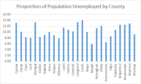
  3. I went and plotted live register numbers per county as a proportion of population (nB, not as a proportion of available labour force because I don’t have those figures to hand at the moment) on an expectation that the shape of the graph would be broadly similar. It’s not.

Live Register Numbers


In other words, I don’t think the story is as a simple as figures shown a map of the country with numbers on each county would you have you think.

Some notes about input to this piece:

Am I saying that we can dismiss the issue of food poverty in Ireland, yerra it’s all grand really? No. I’m not saying that. What I think needs to be done is actual research into the area. I don’t know how you measure it. Maybe you talk to the food support charities, the soup kitchens, the soup banks and you get a sense of changes to demands on their infrastructure in a scientific way rather than relying on anecdote. When society has a problem, it’s best to know as much as possible about that problem rather than guessing the extent of it. Ireland is not a big country. 

What I do feel, however, is that this document, this piece which Mandate/Unite have pushed out is not the best way to do it. I’m not criticising the need to raise awareness of issues surrounding food poverty in a developed country. I’m just suggesting that using a bunch of figures which appear to have little underlying data is not really the best way to go about it. If they have data, it would be nice to see it.

Changes in Life expectancy in Ireland between 1926 and 2006

If everything had gone according to plan,you’d be looking at some initial work regarding the popularity of various baby names in Ireland mainly because although the data for the UK is easy to get at, it’s also by and large, not very interesting to play with. The figures for Ireland are a bit non-straightforward to haul out of the CSO’s website so instead, I decided to look at mortality rates on the grounds that given a graph that compares 1926 and 2006, it’s a dream opportunity to look at displaying the information in the form of a slope graph.

You can find the data here and it was last updated in 2010. It might be interesting to see more recent figures if they are available but at this point, I’m not too bothered. The data is straightforward enough, it’s a 2×7 matrix, there is no cleaning to be done and no major analysis or flutering around to be done with it. For this reason, I brought it into Excel, exploited these instructions here, got slightly frustrated with various aspects of trying to do this in Excel (my next bid will be to have a look at options to do this in R which has to be easier to mess around with but I haven’t looked at whether ggplot2 does slopegraphs or not).

There’s a very simple story underlying these data: typically, in Ireland, life expectancy has increased a lot in the 80 years between 1926 and 2006.

As a general explanation of how the data works, the chart tells you on average, how many more years you are likely to live if you reach the age noted. For this reason, as you get older, the number of years you’re likely to live on from that point drops.

Okay.

Here’s the first graph:


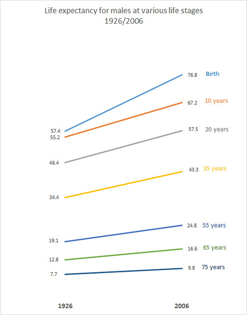
Males

This shows changes in life expectancy for males in the period 1926 to 2006. We have only two time points so I can’t comment on odd variances in there – it is highly unlikely that the line of change is dead on straight.

Key take away points from this:

A baby boy born in 2006 is likely to live almost twenty years longer than a baby boy who was born in 1926.The biggest increases in life expectancy are for the cohort somewhere between 0 and up to 35 and 55 years. After that, the gains are nowhere near as steep. Part of this is explained by major improvements in infant mortality.

Here is the corresponding graph for females:

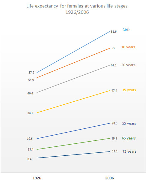
Females


This graph is largely similar in shape to that for males – higher gains the younger you are, again linked to changes in infant mortality rates. However, females get a much bigger push at birth than males did over the period. In 1926, females expected to live on average half a year longer than males from birth. In 2006, the difference is almost 5 years. This can probably be partially explained by changes in maternal mortality over the period.

What is interesting about this in social terms is that although women are likely to live longer than men, they are less likely to be adequately provided for pension wise because inter alia, they haven’t paid into professional plans as long or haven’t made as many social welfare contributions, linked to a) not having worked through marriage (Ireland had a marriage bar until sometime in the 1970s so that married women weren’t taking jobs from family men) b) having taken time off to have children.

I’m interested in obtaining similar data for other countries – anecdotally I seem to remember reading that life expectancy at birth for males in France in 1900 was around 35 years for example.

With respect to the actual graphing of the data, doing it in Excel is easy in some respects, you wind up with a graph that’s reasonably coherent scale wise. It’s just prettifying it is a bit time consuming and not very fun. I brought it into Photoshop mainly to get it out as a decent enough jpeg. None of the relevant templates were exactly as I wanted so I need to look into building standard templates. I will, however, have a look at drawing these things in R.

In the meantime, for a later project I will look at sorting these out in Adobe Illustrator at some stage as well – it is frustrating not having access to simple things like rulers to line stuff up when you’re moving it around the plot.