The Journal website published a story on Food Poverty in Ireland which you can find here. Its main selling point is that the numbers apparently at risk of food poverty are shown on a map of Ireland. It was based on a release by Unite and Mandate and you can find a text from them on the subject here. It’s titled Hungry for Action – Mapping Food Poverty in Ireland.
The map, I suppose, is eye catching. But I don’t think it really works to communicate the problems. For me, the first issue is that the absolute figures are fairly meaningless. Yes, it’s horrible that 112,300 people are at risk of food poverty in Dublin but if you actually take the food poverty figures and calculate them as a proportion of the population for each county, you realise that actually, proportionally, the risk of food poverty is comparatively lowest in Dublin as a proportion of the local population.

Dublin has the lowest proportion of its population at risk of food poverty when we split the population as a whole according to counties.
And that’s before you even look at how the figures are generated in the first place.
The most recent figures available are for 2010 and the figures which the Hungry for Action report provides are extrapolated from these figures:
‘Constructing a Food Poverty Indicator for Ireland’, a study published by the Department
of Social Protection61, found that one-in-ten people experienced food poverty in 2010, or
approximately 457,000 people.The following attempts to estimate the level of food poverty in each county. This is only
an approximation as the study does not provide this data. The approximation factors in
variations in income level (and assumes that income levels will alter the percentage in
food poverty) and 2010 population estimates. Therefore, these figures should be treated
as indicative.
So here’s one big problem already. We can’t really rely on the figures. They are based, to some extent, on guess work, and on an assumption relating to income levels. And they come with the following health warning: They are based on a government study from 2010 which did not break down its global figure according to county.
It should be noted that the above estimates are likely to be conservative.
As stated above, these estimates are based on 2010 data. In 2011 (the last year we
have data for) general deprivation rose by 8 percent. Further, the ESRI described
subsequent budgets as ‘regressive’.
What worries me here is that the figures, as provided in the map graphic, are akin to guess work. They are a breakdown of a national figure with no corresponding data available at county level to even base an extrapolation on. Put simply, we actually don’t know how many people are at risk of food poverty and certainly not split according to county. I’m not sure I agree with releasing a report like this given the caution and caveats with which the figures need to be approached.
However, if we leave that aside, I’m still unhappy with the use of a map to highlight this issue because it doesn’t tell you anything much in relative terms about which parts of the country are particularly affected. The piece by The Journal focuses on the absolute numbers:
The map shows Dublin fares worst with 112,300 people suffering food poverty. Larger counties like Cork and Galway follow close behind, with 50,500 and 25,300 people in need of assistance respectively.
The key problem with this is that – if we accept the figures as being in any way indicative which I have doubts about, Dublin’s figure as a proportion of the population is actually the lowest. It’s highlighted in the graphic above. It’s scant comfort to anyone in that situation of course, but comparatively, the worst off counties are Kerry, Kilkenny, Longford, Monaghan, Donegal and Offaly. Dublin is actually the best off. In certain respects, it doesn’t tell us the story of food poverty in Ireland in real terms.
So what am I saying here?
Well a couple of things
- Choice of graphic is very important. This one does not bring any more to the story I think than a table of figures would have. There’s no way by which you can seriously – and justifiably – compare what’s happening in Dublin with, say, what’s happening in Donegal.
- The figures are not based on any meaningful data. This is evident because they took a national figure from 2010 and extrapolated it out into county subdivisions using a weighting of some things which is not clear from the document provided.
- I went and plotted live register numbers per county as a proportion of population (nB, not as a proportion of available labour force because I don’t have those figures to hand at the moment) on an expectation that the shape of the graph would be broadly similar. It’s not.
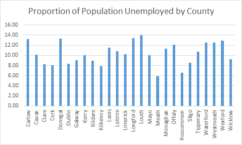
In other words, I don’t think the story is as a simple as figures shown a map of the country with numbers on each county would you have you think.
Some notes about input to this piece:
- Population figures are based on 2011 Census from the Central Statistics Office
- Live Register figures are from July 2013, also from the Central Statistics Office
- Food Poverty figures are from Mandate/Unite here
- I used Excel to generate the charts because I was in a hurry. Sorry. Normally they’d be done with R.
Am I saying that we can dismiss the issue of food poverty in Ireland, yerra it’s all grand really? No. I’m not saying that. What I think needs to be done is actual research into the area. I don’t know how you measure it. Maybe you talk to the food support charities, the soup kitchens, the soup banks and you get a sense of changes to demands on their infrastructure in a scientific way rather than relying on anecdote. When society has a problem, it’s best to know as much as possible about that problem rather than guessing the extent of it. Ireland is not a big country.
What I do feel, however, is that this document, this piece which Mandate/Unite have pushed out is not the best way to do it. I’m not criticising the need to raise awareness of issues surrounding food poverty in a developed country. I’m just suggesting that using a bunch of figures which appear to have little underlying data is not really the best way to go about it. If they have data, it would be nice to see it.